
How to Choose Art Colors That Transform a Room
A room can have beautiful furniture, thoughtful lighting, and all the right finishes, yet still feel unfinished until art brings its colors into conversation. Learning how to choose art colors is less about following a decorating rule and more about noticing what you want to feel when you walk through the door: calm, energized, grounded, playful, or inspired.
The right painting does not have to match every pillow, vase, or rug. In fact, artwork often feels most alive when it adds a new note to the room rather than repeating what is already there. Color-rich art can turn a neutral wall into a destination, soften a formal space, or give a compact condo the sense of personality it deserves.
Start With the Feeling You Want the Room to Hold
Before comparing swatches, pause at the doorway. What is this room for? A bedroom may call for a gentler atmosphere, with ocean blues, misty greens, warm creams, or layered soft violets. A dining room can welcome stronger contrast: cobalt, ruby, emerald, or glowing gold can make gatherings feel warmer and more memorable.
This emotional starting point is more useful than trying to identify one "correct" color. A vibrant abstract painting can feel joyful and expansive in a family room, while a floral work with deep shadows and rich petals can make the same room feel intimate and elegant. Neither choice is automatically better. It depends on the life happening in the space.
Think about the mood you want guests to experience, but also your own daily rhythm. If you want a home that restores you after busy days, choose colors that make you exhale. If you want your office or entryway to feel motivating, a more dynamic composition may be exactly right.
How to Choose Art Colors From What You Already Own
Look for two or three colors already present in the room. They might come from a rug, upholstered chair, curtain, wood undertone, or even the view outside a window. These colors are clues, not restrictions.
A simple approach is to choose art that does one of three things:
Echoes a color already in the room for a cohesive, collected appearance.
Expands the existing palette with a related shade, such as teal beside navy or coral beside terracotta.
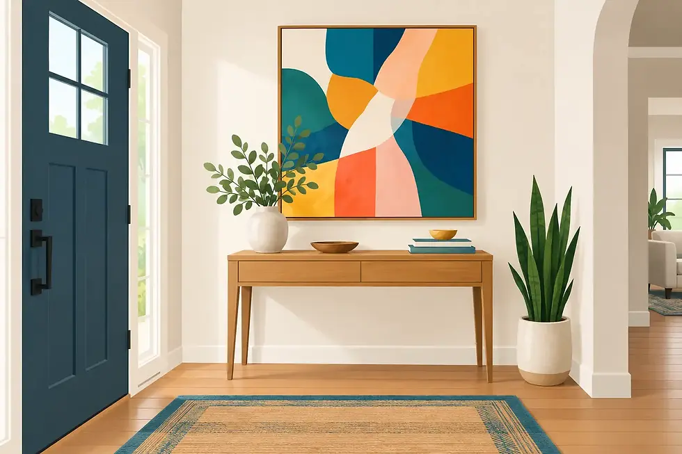
Creates intentional contrast with a color that wakes up the space, such as a bright orange painting against cool gray walls.
Bridges several finishes or colors that currently feel disconnected, such as a work containing warm gold, blue, and cream in a room with brass, navy textiles, and ivory walls.
If your sofa is charcoal and your walls are white, nearly any palette can work. That freedom can feel intimidating, but it is also an invitation to choose art based on emotion rather than obligation. A jewel-toned abstract can become the room's centerpiece. A softer work in pale blues and rose can create a quieter, more layered look.
In a room with many existing colors or patterns, give the eye a place to rest. Art with a more focused palette or generous areas of light can bring balance without becoming invisible.
Do Not Confuse Matching With Harmony
Perfect matching can make a room feel overly planned. Harmony is more nuanced. It allows colors to relate while still leaving room for surprise.
For example, a living room with beige walls, walnut furniture, and cream upholstery may look beautiful with a painting that includes ochre, amber, deep blue, and hints of turquoise. The warm tones connect to the wood, while the blue adds depth and freshness. You do not need turquoise elsewhere in the room for it to belong there.
The same principle works in reverse. If your room already has bold color, art can provide a calmer counterbalance. In a space with a patterned blue rug and colorful pillows, a panoramic work with soft sky tones, water, and neutral shore colors can make the overall design feel considered rather than crowded.
Choose one color in the artwork to repeat once or twice through a small accessory if you want extra cohesion. A throw, ceramic piece, or fresh flowers can quietly connect the room to the painting without turning the space into a color theme.
Let Wall Color Shape the Decision, Not Dictate It
Wall color affects how art appears, especially in changing natural light. White walls make saturated colors feel crisp and allow a vivid painting to take center stage. Deep walls, such as charcoal, forest green, or navy, create a dramatic gallery effect and can make luminous details, metallic accents, and bright pigments glow.
On beige, greige, or warm cream walls, look closely at undertones. A cool blue-gray abstract may create a polished contrast, while art with ochre, red, or warm pink can make the room feel especially inviting. Neither route is wrong. The first feels cleaner and more contemporary; the second feels warmer and more enveloping.
If possible, view artwork at different times of day. Morning light can reveal cool tones, while evening lamps often bring out warmth. This matters particularly with expressive mixed-media, alcohol ink, and faux stained-glass-inspired pieces, where layered color and texture respond beautifully to shifting light.
Consider Scale Before You Fall in Love With a Palette
Color has visual weight. A large painting full of crimson, cobalt, and emerald will naturally command attention, while a smaller work in the same colors may read as an accent. Before deciding, measure the wall and consider how much of the room's energy you want the art to carry.
Over a sofa, bed, or credenza, artwork should generally feel substantial enough to anchor the furniture beneath it. One generously scaled statement piece can make a room feel calmer than several small works competing for attention. On a narrow wall or in a hallway, a vertical piece or a thoughtfully arranged group of smaller works can bring color without overwhelming the passage.
This is where reproductions can be especially practical. A museum-quality giclée makes it possible to enjoy a favorite composition at a size and price point that suits your space, while an original painting offers the singular presence of hand-applied marks, texture, and color variation. Choose according to what matters most for the room and your collecting journey.
Use Contrast With Confidence
Many people hesitate to choose colorful art because they fear it will be too bold. Yet a neutral room is often the safest place for a confident painting. A vivid work can supply the personality that beige upholstery and pale walls intentionally leave open.
Contrast does not only mean bright versus neutral. It can mean cool colors against warm finishes, organic fluid forms beside structured furniture, or a detailed floral composition in a minimalist room. These differences create tension in the best sense: the space feels alive and personal.
If you are drawn to a painting but worry about its intensity, ask whether the color is actually the problem or whether the scale is. A smaller energetic piece may be perfect near a reading chair, in an entryway, or as part of a gallery wall. Conversely, a large work with a limited palette can still make a powerful statement through size alone.
Choose Art You Will Keep Looking At
Decor trends can offer useful ideas, but artwork has a longer relationship with your home. The colors you choose should reward attention over time. Look for depth: small shifts in tone, unexpected accents, layered shapes, or passages that feel different from across the room than they do up close.
A painting can coordinate with your current décor and still have enough character to move with you into another home or a newly redesigned room. This is especially true of artwork built around enduring color relationships: blues with warm earth tones, greens with gold, rich florals against dark backgrounds, or luminous stained-glass-inspired combinations.
At Mila's Creations, vibrant original paintings and high-definition giclées are created to offer that kind of lasting visual presence. The goal is not simply to fill wall space, but to help a room feel more like the people who live or work within it.
Before making your final choice, place a photo of the artwork beside a photo of the room and step away for a few minutes. When you return, notice where your eye goes first and how the pairing makes you feel. The best color choice is often the one that keeps inviting you back, long after the wall has stopped being blank.


Comments